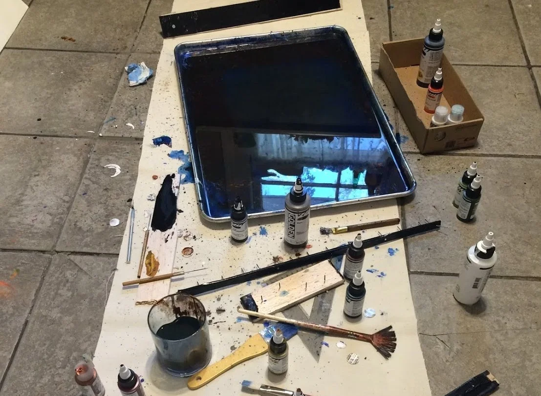
Marbling: A Beginner's Experience

Ebru, also known as marbling, is a traditional turkish art that has evolved and developed over centuries into a multidimensional art.

It is performed by placing paint on the surface of a liquid called a size. The size is rather dense so that watered down paints and pigments can be applied to it without sinking. These paints and pigments sit on the surface of a size and, depending on how much water they contain, spread over the surface in different ways. They can then be manipulated with tools like combs or needles. Depending on how they are manipulated they may mix or they may remain clearly differentiated. Paper that has been treated with a mordant (to make the pigment stick) is placed over the surface so the paint can adhere. The paper is then rinsed and hung or laid to dry.

 There are many different strategies in application and manipulation of paint and of paper which lead to different results. In fact you can never exactly repeat or reproduce a result, though you may try or manage to create something similar, because it is such a sensitive process. The products can be large or small, abstract or realistic, complex or simple. It can be applied to a plethora of materials and make use of different pigments or paints; Ebru artists are constantly innovating in their practices. 

This past Fall I wanted to expand the reaches of my skill set by experimenting with an entirely new [to me] process. I decided to try marbling because it is performed entirely differently from my usual practice of illustration—on the surface of a liquid. My most comfortable style of drawing uses a lot of hatching and line work. I wanted to challenge myself to draw more fluidly and explore a different creative mindset. After some initial research and practice, I quickly became inspired by the history, the process, and the results of Ebru. In marbling, all of the aspects of the composition - color, form, movement, etc. - are integrally related. Depending on how you build a composition you can achieve very different results.

A major concept I kept in mind throughout this process was "hiding" elements within compositions. What are the different ways to camouflage elements?

Tools:

  • Combs of varying patterns (handmade with nails, balsa wood, duct tape)

  • 16x22 inch aluminum baking pans

  • 100% cotton paper- Strathmore, Arches, Stonehenge- varying weights(90lb/250gsm, 140lb/300gsm), 22x30 inches cut into 2-4 pieces.


Click to enlarge photos and play videos.


Batch 1 & 2: Muddy & Indistinct


When I first started marbling, I looked at a number of project tutorials, but settled on one for the sake of clarity. This one called for methylcellulose as the size, watered-down acrylics as the pigment, and heavy weight, cotton-rag paper as the substrate. The methylcellulose was to be kept refrigerated after mixing and setting in order to prevent molding.

Batch 1: Trying To Make Herbal & Bird Motifs

The results I did get were fairly vague for a number of technical reasons, in addition to strategic.

Even though I watched a number of videos of artists marbling a range of designs, I still didn't seem to have a sense of how the colors were going to spread or interact, how the colors were going to move, how the order in which I did things in would affect the results. When I first tried to create a figural image, the paint would expand too much and the image seemed impossible to shape. Gradually I began to get a feel for placing the paint and had some luck with forms. 

The acrylic paint would be more bonded to the size than the paper, so if I rinsed off the extra methylcellulose, nearly all of the color would come off with it. If I left the excess size to dry, it would result in large puddles, which were mucky, warped the paper, and completely obscured the designs underneath. The colors did not spread evenly over the methylcellulose and would form dense patterns in some areas and pale ones in others. The paper, being very stiff, would push the fluid underneath it, creating distortions in the design or trapping air, which left bare spots.

Batch 2: Polar Bears & Blues

The first batch of designs this round were an absolute wreck. Tigers, birds, and even simple herbal motifs were unintelligible. In the second, I managed to get some forms (polar bears), but they were largely washed out and the size was too cold and thick. 

Interlude: An Attempt to Salvage With Paint

In order to make the most of my flopped prints, I decided to try mimicking the effect of ebru with gouache paint, by applying it to the marbled paper .This helped me play with composition and get a sense for drawing shapes out of formless painting. I actually really like the effect of it, even though I didn't use these in any finished product. I think the contrast of the ethereal and unclear paper with the soft but brightly defined gouache has a really alluring effect, as though the figures are literally arising from the swirls.


Rounds 3 & 4: Refined Technique


There were a couple of very important changes between this round and the last: 

  • Upon further research, I discovered that carageenan is used more often as an affordable marbling size-- the result was smoother movements and less mixing of the paint and gel.

  • I began treating the paper with Alum, a mordant, to bond the pigment and the paper better.

  • I simply had an even better understanding of the way the paint and fluid respond to manipulation, and a sort of "order of operations".

  • I stopped keeping the size in the refrigerator, as being too cool caused the water to move along the surface in crystalline ways. Instead I made the size the morning of.

Challenges:

  • Achieving even coating of mordant.

  • Achieving right amount of mordant (too much causes and "cracking" of pigment, too little doesn't work).

  • Laying down paper without distortions or bubbles.

Round 3: Successful Polar Bears & Blues

Above: The three bears print was used in two different scarf designs, a long and a square one (see Ice Caps Collection).

See this Instagram video by @dioni_macaroni * 18 likes

Above: Blue spot design was digitally manipulated to create a larger, concentric design. This was used in the Ice Caps Collection.

Round 4: Oil Effect

While I still was having trouble with alum and air bubbles, one of the trickiest parts of this round was color. Where do I draw the line between realism and abstraction? How do I make something sad and terrible beautiful?

Above: Too much alum causes the acrylic pigments to pull and fracture on the paper.

Above: Unevenness while laying out the paper leads to bubbles or density lines (dark strips, faded sections). Top left birds and top right spillage design were both turned into repeat patterns and used in scarf designs. See Petrol Collection.


Round 5: Silk Routes


In this round I was largely inspired by textile traditions shared and evolved via the Silk Road. There was animal trade between continents for circuses and nobility, pelts and objects made with animal parts were sold, and textiles depicting exotic animals were carried west, designed specifically to maximize sales in Europe. At present, what were parts of the Silk Road are battle grounds for for oil. My focus was roundels featuring lions, tigers in the grasses, and a different design approach to birds. I produced a particularly large number of prints this day, working for at least 8 hours, and I actually had to make a second batch of carageenan. Luckily, I had coated extra paper the day before!

See this Instagram video by @dioni_macaroni * 32 likes

Above: Trying to create designs within what is supposed to be a circle or other geometry is very difficult. The smallest movements elsewhere, or unevenness while applying pigment, distort and shift the surface and "ruin" the shape.

Above: A successful tiger illustration. It was digitally cleaned and used as a part of the Panthera Collection.

Above left: A design that became "too far gone" in the process to recover. The areas of paint became too small and lost. There was no way to recover the boldness nor the desired form from the composition.

Above right: Detail of the successful tiger, used in my Panthera Collection.

Bottom left: Long density gap runs through design. The halves were shifted in photoshop to close the white space. This bird was also digitally cleaned and recolored to become a more abstracted representation of oil (see Petrol Collection).

Rounds 6,7,8,9: Detail and fine movements


By this time I was home in Massachusetts on winter break. Still set on having 3 proper collections, a bit more relaxed from being on school break, and a bit more confident and comfortable with the process, I decided to do some more marbling. The level of detail I could achieve was continuing to increase. Additionally, I acquired a new tray (a plastic bin) and had much more work space.

Something notable was that the indoor environment was drier and colder compared to Savannah, where it was essentially always damp. As a result the carageenan congealed a lot on the surface. It was not as responsive to manipulation and I had to use many small, repetitive strokes to shift it. This led to a very different overall appearance. The paint did not spread on the surface in the same way and instead seemed to sit on it more like the way paint sits on paper. Even when I laid down paper at least half of the paints remained on the surface of the size, it had built up so thickly. When I tried to wet the surface with a spray bottle, the paint spread over the surface but the colors still did not move well. Too much water and I had no control over the colors. In one case the paint spread so much I had to stop marbling and start again the next day with fresh carageenan. I no longer let carageenan sit over night or for any extended period of time.

Round 6: Trying for a Tiger

Top left: The first marbling I did in the different climate, I had not been able to adapt my strategy and had a hard time correcting and controlling the forms. The effect of sprayed water is most noticeable in the black paint.

Top right: The second try, this was a much more successful composition, and the way the colors sat/diffused on the surface almost reminded me of the ghostly gouache examples from earlier. This piece took over two hours to make.

Bottom right: After the second tiger, I decided to try creating a leopard. The size was very thick so I laid down a good amount of water and tried to let it absorb. An utter failure, the paint was hopeless and spread in the water, unable to be adjusted and manipulated.

Round 7: Lion Prides

Bottom right: I had a lot of fun with the expressions of each lion, but in order to maintain the aesthetic of the collection, I decided to marble a single male lion's head looking out from the grass. This image was digitally cleaned and used in the Panthera Collection.

Round 8: Revisiting the Arctic

At this point, with more experience and time, I decided to revisit arctic designs. However, I found that i preferred the simplicity of color, contrast, form and flow of the early designs, and that too much was lost in trying to make it more.

These arctic revisits didn’t feel quite icy enough, nor stay within the same blue scheme of the prior attempts. The ice forms were too nondescript and without character for a single print design. They could be even probably be confused for something like clouds. Also, the palette was no longer cool or icy enough.

Round 9: Third Bird, Poachers, and a Leopard Print

Above: I tried a third time to design a bird obscured in oil, using all that I had learned in color, technique, and even preparing and laying the paper. This bird, while interesting, is a little too well hidden and strays too much from the other Petrol designs. I would love to try to translate something like this into a wallpaper though, or onto velvet cushions.

Above: These hunter/defender silhouettes were designed with the idea of repeating the motif in a concentric way, similar to the Ice Caps scarf 'Thaw'. I decided against using human figures however, as I thought it would distract from the power of the animals and potentially carry extra controversy.

Above: This Leopard was the last marble print I made. Some uneven pressure distorted the right half of the face and created ripples in the right corner, but I was pleased with the composition and detail I managed. This Leopard was digitally cleaned and used as a part of the Panthera Collection.

Above: Some process shots of paint sitting on the carageenan.


Going Forward


For more information on marbling, visit these pages: 

     Notable Artists:

Garip Ay - Robert Wu - Jemma Lewis 

     Technical Information:

History - Alum - Carageenan 

Pantomime Pillows

The Pantomime pillows branched from exploration of the question of whether hand gestures could exist as purely physical and visual cues, without cultural context.

Export4161.jpg

I began by thinking of gestures that were physically indicative of a story, not culturally, utilizing continuity. By depicting the gesture as an action, as a series of drawings, while also removing them from the specificity or indications of the whole of the human body, I hoped to extract them from cultural context. Specifically, the Pantomime pillows attempt this by creating new separate contexts and by using form and color within them. 

As physical objects, the pillows are self contained, allowing them, and their gestures, to have their own identities. The triangle form of each pillow is indicative of change-- they are oblong and therefore not stable, suggesting some kind of forward movement. The three hands on each pillow are successive parts of a single motion, emphasized by the gradating colors. Additionally, the forms and movement of the actions themselves relate to the forms of the pillows; the opening hands spread toward the wide base of the triangle while the closing hands grasp at the point.

Hands have been key tools for communication between humans since before we were human. They develop different meanings in different groups-- some completely independently and some in conjunction with or as a result of interaction between these groups. They can be specific within different religions and spiritualities, locales, nations, ethnic groups, and even within specific families. The incredible thing about hand gestures is that the complexity of their meaning relies on their context and intention. When separated from their contexts, hand gestures are either: stripped to their most fundamental physical indications; their implications are left entirely to the interpretation of the witness, with that person's history becoming the context.


Below I've included my portfolio entry for Pantomime:

Dione Satchel: Accessory & Print

"Dione" is a satchel I created for my senior Fibers portfolio in the Sewing Tech class for Accessory Design. The idea evolved out of my desperate desire to have a multi-functional bag dressed up to look like a briefcase. While developing material, construction, design, technical skill, and the combination of hand processes, the project continued to evolve into one of a more personal nature. With just about two weeks to design and produce it, I saw the project as an opportunity to push and expand my skills in ideation, prototyping, and construction. It was also an opportunity to try to combine other technical processes with accessory design. 


design & Construction

"Dione" features a briefcase handle, a detachable and adjustable strap, strategically placed D-rings that allow for cross body or backpack use, buckles, a turn-lock, and a magnetic snap pocket protected by the flap of the bag. The flap is adorned with a hand screen printed design. It's body is a variation on gusset clutch construction -- the type of bag we were all assigned to make. However, it's size and other features were inspired by classic satchel construction.

Draft of "Dione" specifications.

The materials I used to construct the bag are; pink, full finish, 3.75 ounce cowhide with mellow temper; chocolate brown, full grain, 7 oz cowhide; 5 oz white, full finish, cowhide; brass hardware; 7 inch YKK zipper; woven, striped cotton.

The flap and body are fully lined and interfaced with a stiffener and joints are reinforced with tape. 

In order to be short enough for a cross-body and long enough for a backpack, the strap consists of two pieces. The attach with a buckle and loop. The strap reaches 45 inches at its longest and can be made as short as 34 inches. 


Screen Printing on Leather: Mermaid Design

As a way of personalizing the product, I decide to screen-print the face of the bag. The mermaid design is a more developed version of an early logo prototype. To me, mermaids are symbolic of creative freedom and of curiosity.

I altered the design with more elaborate line-work, a more original tail design, and by making the figures bare-chested as a representation of freedom of expression. Scallop shells, kelp scrolls, and pearls reference the ocean. I integrated the mermaids into the space using decorative elements, which interact with the hardware and spread color across the face of the bag.

mermaid color sep.jpg

I drew the design with the intention of screen-printing it. Using a black ink brush, vellum paper, and a compositional outline, I created five color separations. Using my bag prototype as a template, I drew the environmental elements as color separations also. The drawings were scanned, cleaned in photoshop, and then printed separately on transparency film to expose the screens with. I allowed the layers to overlap in order to create more color complexity and increase the appearance of highlights, tone, and shading.

I cut four pieces of leather to be printed on; three drafts plus the final product. Due to the fact the the leather included seam allowances, I used my template to lightly mark the center, outer corners, and rivet spots. Using the spare leather, I tested the separations, the ink colors, and the screen placements, before completing the final print. The size of the screens and smooth texture of the leather meant I needed a friend to hold the screen while I pulled the ink (special thanks to Thomas Flynn II). It was also important to allow the ink enough drying time before printing the next layer because the finish of the leather meant it adhered only to the surface. A hairdryer was used to cure the inks.


Below I've included my portfolio entry for the satchel:

Marbling A Tiger: Video

The video above is a compilation of clips filmed over about 15 minutes of marbling. The total amount of time it took me to finish the illustration was around two hours. 

Marbling as a process relies on a number of variables all of which are sensitive to circumstance. For example, the quality of the carageenan, the gel-like liquid on which I was marbling, plays a heavy role in the movement of the paints which are spread on top. If the carageenan is particularly thick or thin, results can be drastically different. In the video above the carageenan was the thickest I had ever worked with, though it only sat mixed for one day. This is because I was staying in Massachusetts this winter and the environment was drier and colder compared to when I had previously marbled in Savannah, where the air was much more humid and warm. As a result of the congealing, the carageenan was not as responsive to manipulation and I had to use many small, repetitive strokes to shift it, which led to a different overall appearance. Also, the paint did not spread on the surface in the same way and instead seemed to sit on it more like the way paint sits on paper. To counteract this, I tried to wet the surface with a spray bottle. This helped the paint spread over the surface but the colors still did not move well with the carageenan. This technique led to the presence of a different visual effect than marbling usually produces, something I might compare to watercolor. How fluid the paints are, how you place the paper onto the surface of the carageenan, the proportions of the mordant mix, the material content of the paper, and how long after treatment the paper is used also all have an impact on the final result.

In the end Marbling is a technique I will continue to use and explore in the future. I look forward to discovering creative solutions in or through marbling.

For more information on marbling, visit these pages: 

     Artists:

Garip AyRobert WuJemma Lewis 

     Technical Information:

History - AlumCarageenan